Research Hub KyivUX
How we made respondent screening cheaper for the platform and easier for the people going through it.

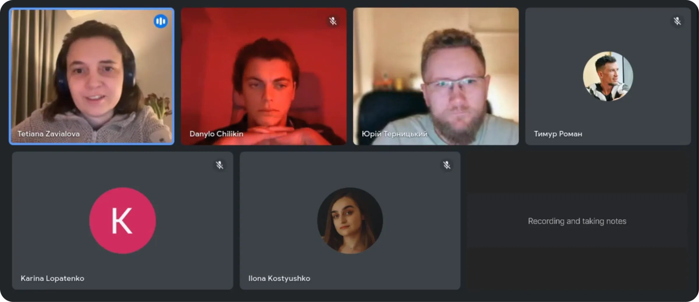
Team of 4 product designers
- Danylo Chilikin
- Ilona Kostyushko
- Karina Lopatenko
- Timur Roman
Summary
The short version
Research Hub is a community-driven research platform created by KyivUX. It connects researchers with people who are ready to share real experience with Ukrainian products and services – and lets them take their reward as a donation to the Armed Forces of Ukraine (AFU) instead of cash. We were fortunate to work on it as a team of four designers.
The platform had one expensive problem: manual moderation. Reviewing applications, correspondence, onboarding, assessing motivation – all of it consumed more than 55% of the monthly research budget.
We proposed letting respondents record a short video or audio answer during screening, so moderators could assess relevance before the interview stage.
It worked. In the second iteration six of eight respondents recorded an answer – five on video, one on audio. In the first, one of thirteen did.

8% to 63%
screener conversion, across two iterations.
75%
chose to record video or audio – our bar was 60%.
100%
found the instruction and example video useful.
The problem
Screening cost more than the research
We started with stakeholder interviews – we needed to know where the budget actually leaked before proposing anything.
High cost of moderation
Moderation ate more than 55% of the monthly research budget and around 40% of the cost per respondent.
A leaky funnel
Screening and no-shows dropped more than 60% of applicants upfront and another 30–50% of those who reached the call turned out irrelevant.
Need for the right audience
Claimed experience often went unconfirmed in conversation, and some treat participation as «regular income».
Hidden indirect costs
Searching, onboarding, and communication quietly inflate the true cost per study.
Assumptions
What we thought would stop people
Before talking to anyone, we wrote down what we imagined a respondent might be afraid to ask out loud. These weren't findings – they were the constraints any solution would have to respect.
«Can you see my peeling wallpaper?»
«Will my boss see that I'm complaining about him?»
«I don't know where to start my video story»
«I don't understand how long this might take – I value my time»
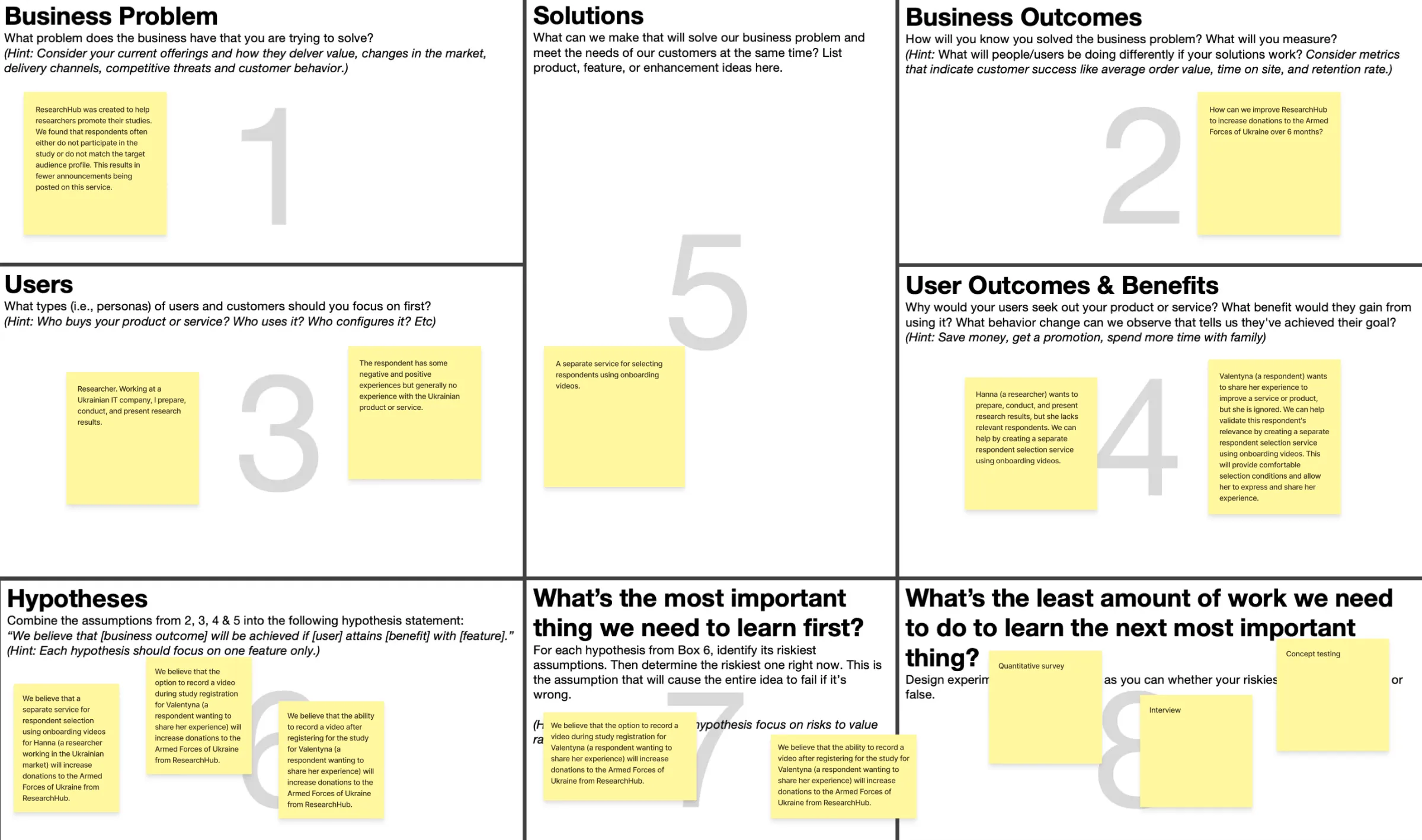
Lean UX canvas
What business outcome we were actually chasing
Before any design, we filled a Lean UX Canvas. It forced one uncomfortable question: what changes in user behaviour would prove we solved the business problem.
Outcome
«How might we improve Research Hub so that donations to the AFU grow over six months?»
Framing it this way changed the conversation. The goal wasn't «more videos», but more relevant respondents reaching interviews, so that researchers keep posting studies and the donation model keeps working.
Main hypothesis
If we let respondents record a short video during study registration, we will increase donations to the Armed Forces of Ukraine.
JTBD and value proposition canvas
«When I fill in a questionnaire, I want to record a short video about my experience, so I can convey my thoughts more precisely»
Three aspects of value anchored everything that followed: being heard, understanding how to prepare and record, and feeling safe.
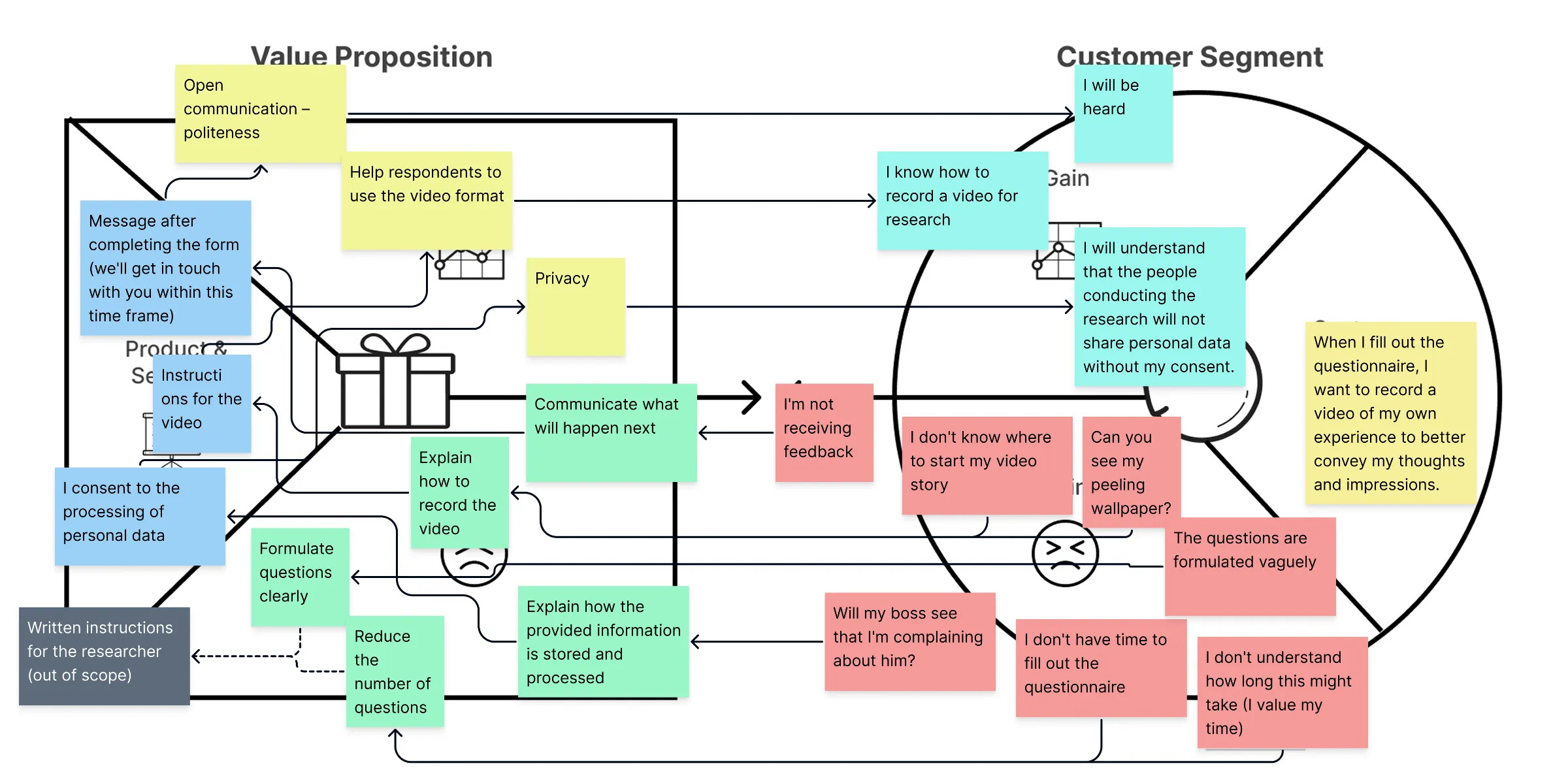
Working through the canvas turned those aspects into a problem statement we could design against: a respondent wants to share experience to help improve a product, but hesitates – doesn't know where to start, worries about looking out of place on video, has concerns about confidentiality, and isn't sure they'll get any feedback. That tension leads to dropping out, despite a sincere wish to be useful.
Validation plan
We set the pass marks before we built anything
Three phases, three thresholds, agreed with the Product Owner in advance – so no one could move the goalposts once results came in.
Phase 1
Survey
1 in 3 already use video to communicate with people
Phase 2
Interviews
2 of 5 use the format regularly and call it comfortable
Phase 3
Concept test
3 of 5 agree to record a video at registration
Method
Two rounds, six weeks
Round one to understand whether the format was even plausible. Round two to test the thing we built.
Round 1
Survey with 12 respondents + 5 interviews
Open questions on top of the quantitative part, to catch the reasons behind the numbers.
Round 2
Survey with 8 respondents + moderated testing with 5
The same people met the real prototype and we watched them use it.
Key insight
People send voice notes every day. In our screener, one person out of thirteen recorded.
That gap is the whole project. The format was ordinary in their lives and impossible in our flow – which meant the problem was ours, not theirs.

- Use video or audio messages constantly, almost every day60%
- Send video or audio messages several times a week20%
- Want to start using this format in the future, indicating potential interest10%
- Very rarely, only when I really need it10%
Interviews
Ages 18 to 60, 14 to 62 minutes each
We asked what stops people – and heard the same four things: the value of video wasn't clear, technical limits, fear of the camera, no instructions. Audio kept coming up as the comfortable middle ground, which is why choice became part of the solution.
Five sessions, 14 to 62 minutes each
Mental models
Five mental spaces emerged from the quotes alone
We took every key quote, clustered similar ones into groups and groups into «towers», and arranged them chronologically. No journey map was drawn in advance – but the towers started to resemble one on their own. In the problem zone you can watch the type of thinking change from one action to the next: exactly where confidence drops.
- Finding a study
- Deciding to participate
- Choosing the format
- Expecting impact
- Expecting influence
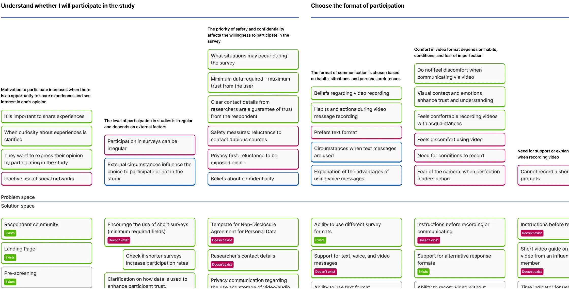
Under the problem towers we mapped a solution space and tagged every idea as existing or missing. The «missing» column became our backlog.
Synthesis
The problem wasn't the format, but uncertainty
Our assumptions were half right. People weren't rejecting video – they didn't understand why they needed it, and nobody had told them how to do it well.
Barriers
- Hard to find research
- Uncertainty of conditions
- Participation format
- Lack of understanding of value
What we did
- Transparency of the process
- Clear instructions
- Flexible formats
- Motivation and feedback
Workshop with product owner
Three priorities, agreed in one session
We brought the solution space to the Product Owner and left with three things worth building – and permission to drop the rest.
- Transparent process → more trust
- Feedback → higher motivation to participate
- An alternative for those who do not want to record video
- Convenient recording process
- Better explanation of how data is used
- Automation of respondent selection
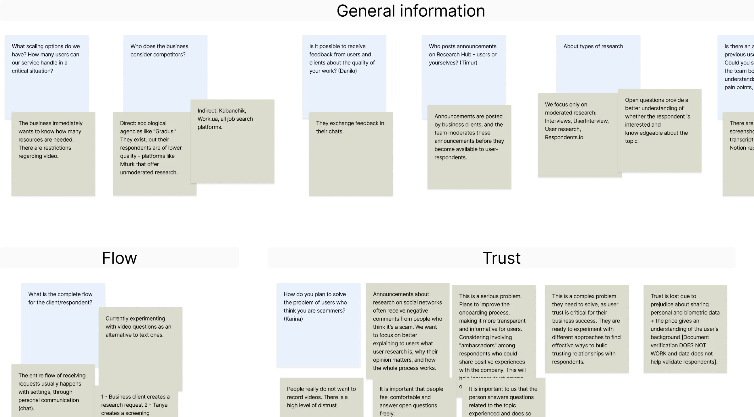
What we adopted
Trust and motivation of respondents
Simple and flexible response format
Confidence in confidentiality

Scenarios
We fixed the four stages with the highest pressure of choice
Everything before these four steps was fine. Everything expensive happened inside them.
Deciding to participate
- Communicate confidentiality and data usage before the survey starts
Filling the form
- Privacy and video-usage policies
- Duration and number of questions
- Purpose of the research
Recording the answer
- Video instruction with a text alternative
- Audio as an alternative
- A thank-you after recording
Getting the invitation
- Structured response template
- Alternative channels for low digital literacy
Customer journey map
Respondent screening steps
Above – how it worked. Below – how it should work, including the two alternative paths we had to support when the main one fails: recording in a third-party app, or being reached through a messenger.
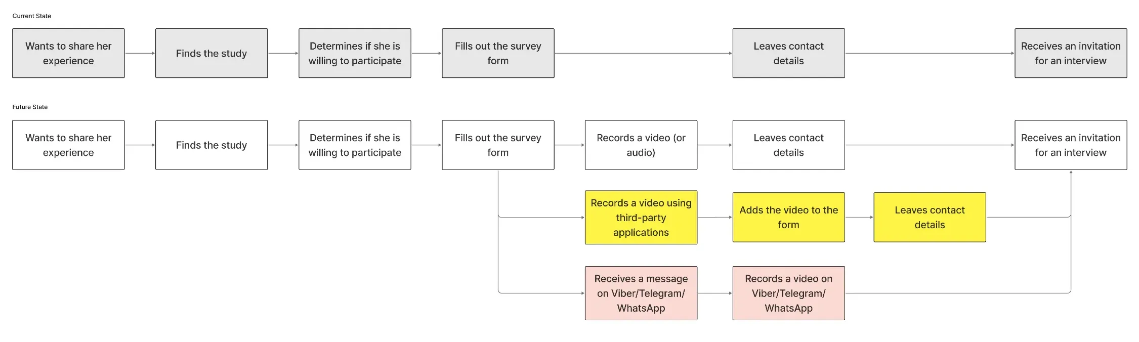
The fix was to replace personal contact with a request for a short video or audio answer. Motivation, sincerity and real experience become assessable without pulling in a moderator.
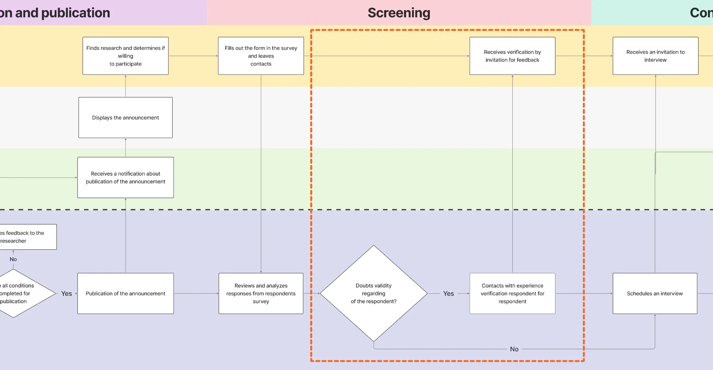
Service blueprint
The most expensive habit was video verification
A blueprint connected the respondent's outer steps with the moderator's inner ones. The bottleneck sat at screening: whenever experience looked doubtful, the moderator reached out personally.
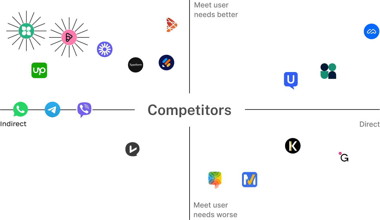
Competitor scan
Platforms that already ask people to record themselves
We looked beyond research tools – at Preply, Gradus, Maze, and at messengers people record in every day. Criteria: the experience of recording, emotional comfort, clarity of instructions.
What we adopted
Transparent expectations, so the person knows exactly what's asked
Clear instructions, with the option of a test recording
Example videos for orientation
Prototype
No-code on purpose
The point was to test the full experience end to end, not to build infrastructure. The tool came out of my competitor scan: Aida Form, lightweight and able to handle video, audio and text in one survey. After Product Owner feedback we moved to it from Typeform and rebuilt the flow into 8 sections.
A multi-format tool
Video, audio and text in one flow, so nobody is forced into a format they can't manage.
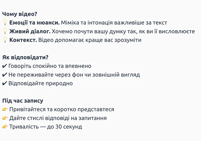
Rules before recording
Why we ask, how to answer, and a 30-second cap – short enough to review quickly, long enough to carry context.
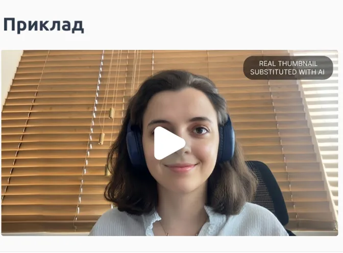
An example to follow
Every tester named it as the most useful element. It removed the «what am I supposed to say» problem entirely.
The flow
Twelve sections, each answering a question the user would otherwise ask themselves
How it looked
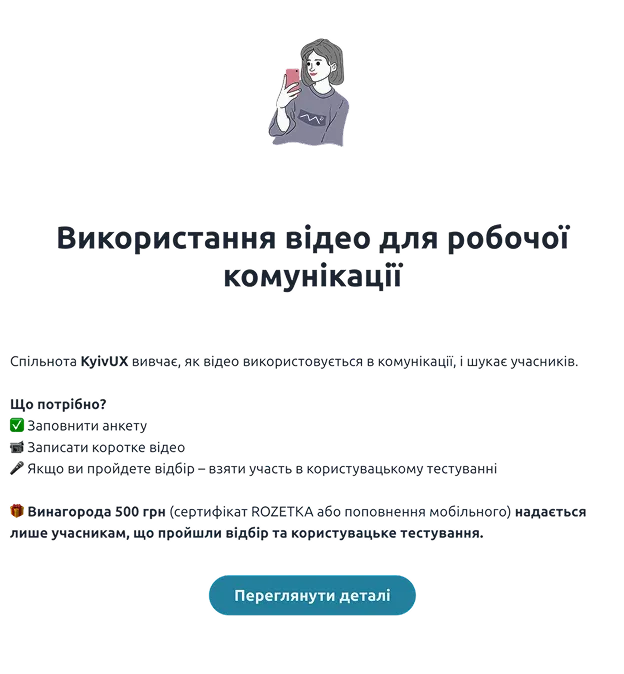
Introduction
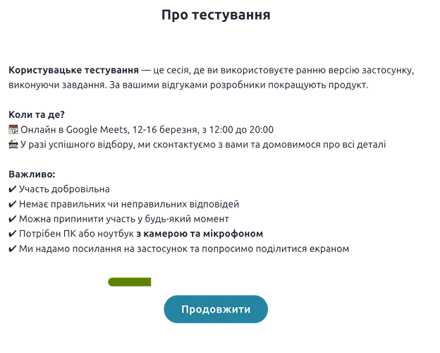
About the test
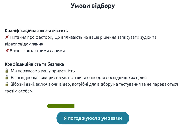
Selection terms
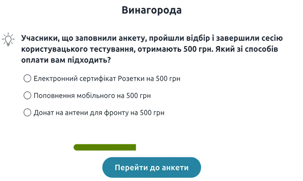
Reward
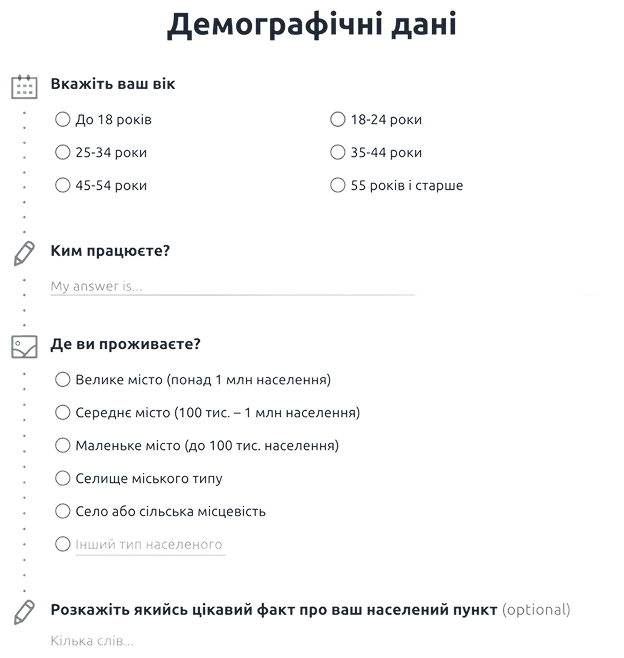
Demographics
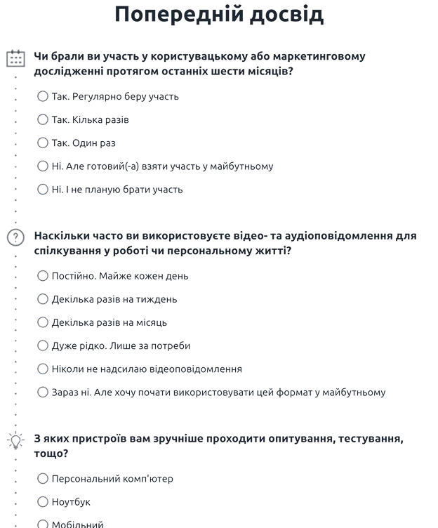
Previous experience
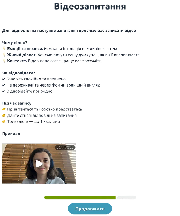
Video question with instruction and example
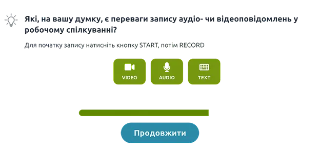
Different options for making a response
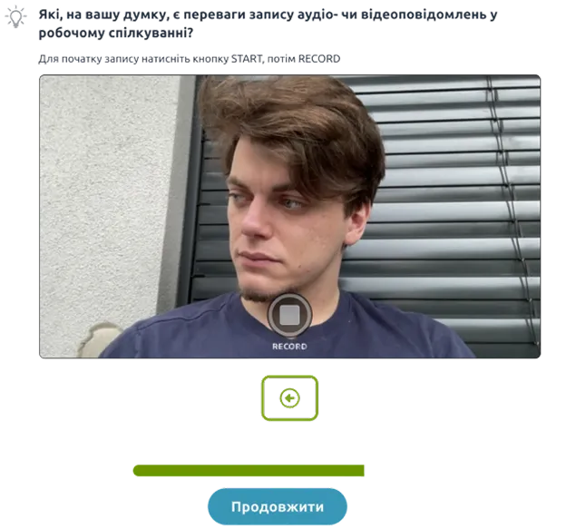
Video recording
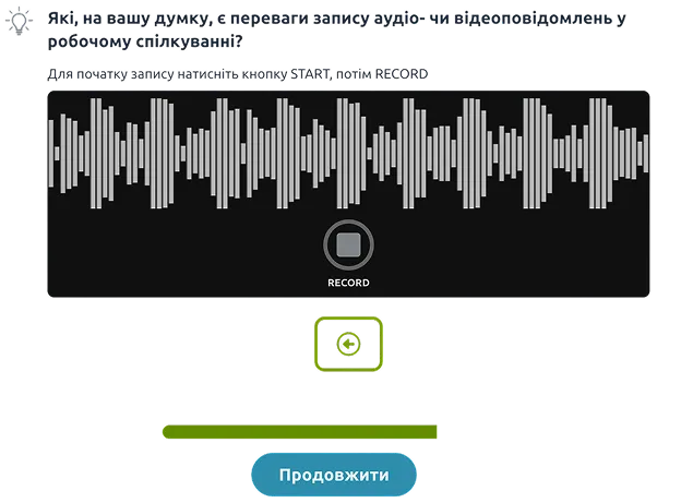
Audio recording
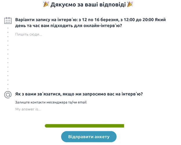
Thank you and scheduling
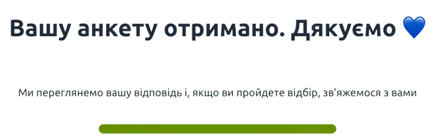
Exit screen
Usability testing
Five questions for five very different people
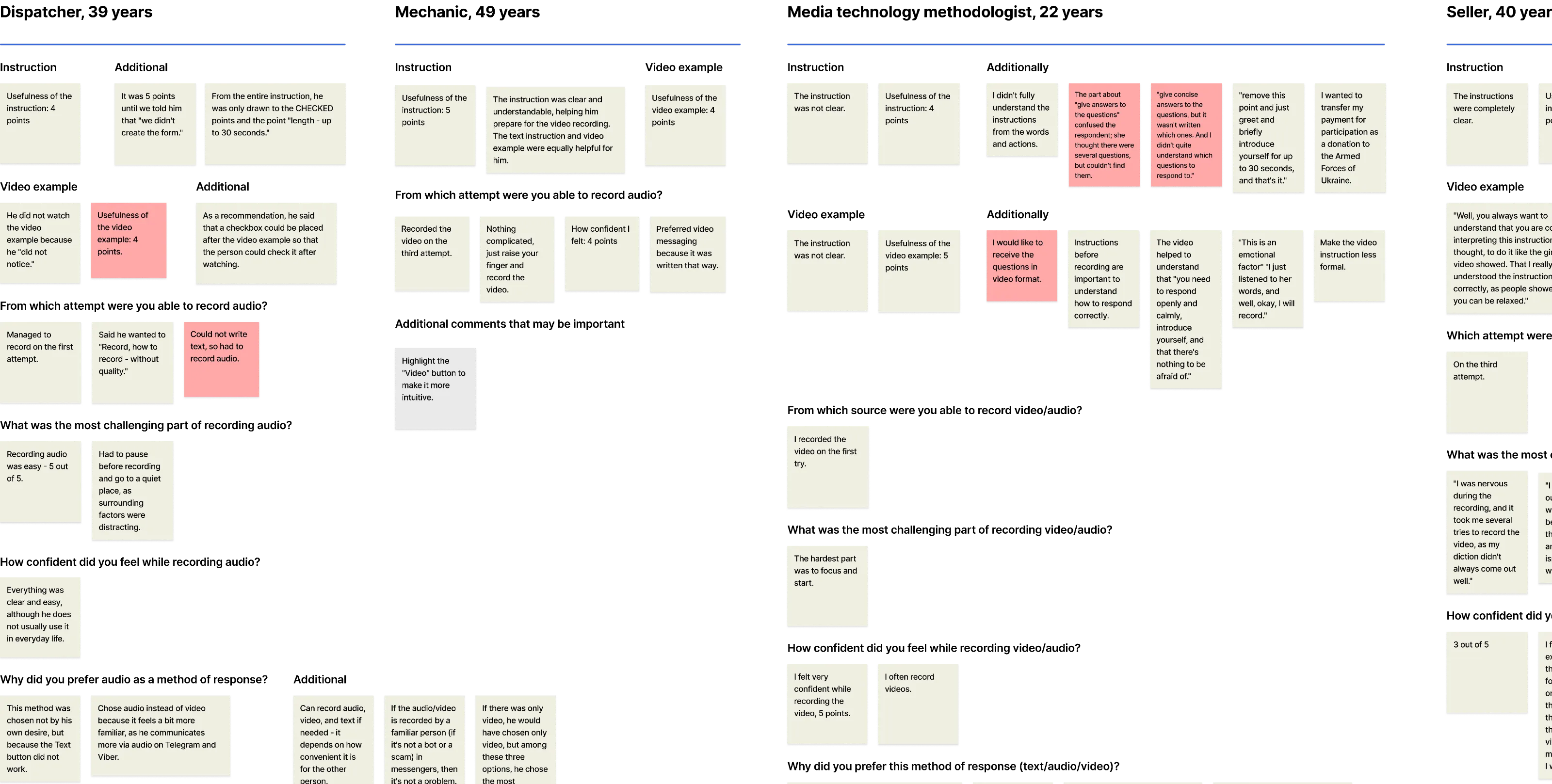
A dispatcher (39), a mechanic (49), a media technology methodologist (22), a seller (40), and someone temporarily unemployed (33).
- Is it clear what needs to be done?
- How useful is the instruction?
- Does the video example instill confidence?
- What format is chosen voluntarily?
- How many attempts are needed for recording?


Findings from testing
What people said
«I had to first say out loud what I wanted to say before recording. That's an extra step you don't need when writing text»
Seller, 40
«The video helped me understand that you need to open up, calmly introduce yourself, and that there's nothing to be afraid of»
Methodologist, 22
«Nothing complicated – just raise your finger and record the video»
Mechanic, 49
«Chose audio, not video – the text button didn't work»
Dispatcher, 39
Results
We set the bar at 60% and everything came back above it
We expected video to be a barrier for part of the audience – too personal, technically awkward, or simply inconvenient. So the thresholds were cautious.
- Expectations
- Actual value
- 60%75%Recorded video/audio
- 60%63%Recorded video
- 75%100%Usefulness of the instruction
- 75%100%Usefulness of the video example
- 75%100%Confidence during recording
Impact
Comparing the first round with the second
Of the five people who recorded video in the second iteration, three were 45 or older – the group we had quietly assumed would refuse.
Previous version of the screener
1 out of 13 respondents recorded video (8%)
Updated version of the screener
5 out of 8 respondents recorded video (63%) *
* One more respondent recorded audio, but the first version had no such format – so it isn't counted in this chart.
- 8%Previous version
- 63%Updated version
Conclusions
We didn't automate moderation, but moved it earlier
Instead of expensive human effort late in the funnel – a system that collects better signals early, where mistakes are cheap. Instead of a complicated process – a clear, trust-based interaction.
Most people chose video or audio
75% picked formats we had assumed were too personal to ask for
Instructions lowered the barrier at the start
The instructions and example video proved useful for every tester, easing entry at the start
Some people still feel unsure in front of the camera
An honest signal that the screener has room to be even better
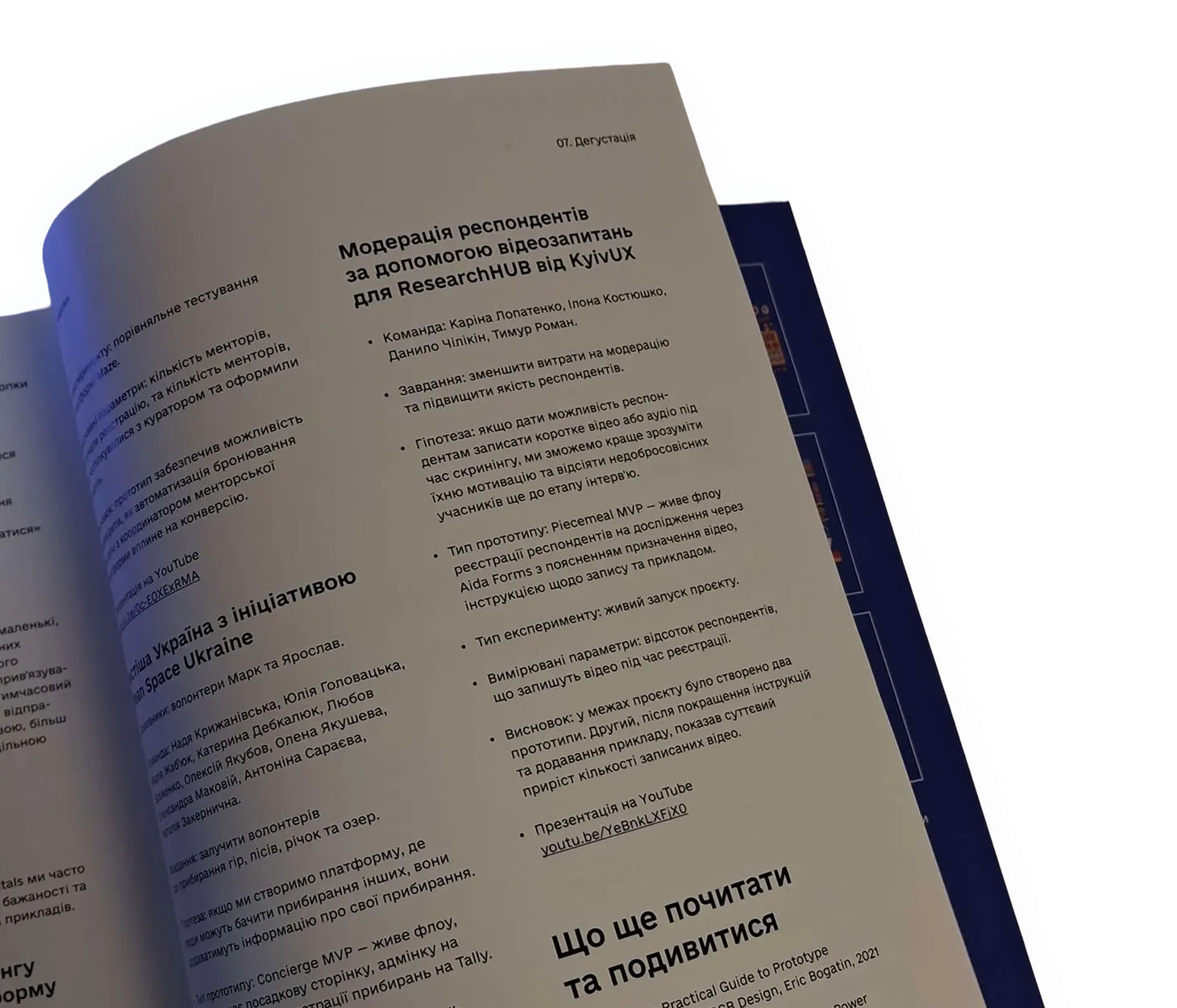
Featured
The project was written up in a book on product design
«Смачні Кнопки» (Tasty Buttons), p. 293